A study of volatility timing for different assets
Published:
A study of volatility timing for different assets
Is it possible to beat the market by using volatility in your favor?
It is known that markets returns are not correlated: knowing the return today doesn’t tell me anything about the returns tumorrow. But volatility is, as you’ll see in this study. If we add the additional suposition that when volatility is high, large losses occur in a greater amount than great wins, then we could have a simple method to beat the market: Move the asset into cash if volatility crosses a given threshold, reinvest if not.
Conclusion: The method seems to work across a variety of assets, but only when there are substantial busts in the time series (Like the 2000 and 2009 crashes). This might be due to there being higher degrees of irrationality in the market during those times, from which a rational investor can profit. For this same reason, I hypothetise that active investors will have a greater change of beating the market if there are crisis in the period studied than otherwise.
import numpy as np
import pandas as pd
import matplotlib.pyplot as plt
import seaborn as sns
import scipy as sp
%matplotlib inline
sns.set()
from yahoo_finance import Share
share=Share('SPY')
prices=share.get_historical('1995-01-01','2012-01-01')
data=pd.DataFrame(prices)
data.sort_index(inplace=True,ascending=False)
data.reset_index(inplace=True,drop=True)
data['Adj_Close']=pd.to_numeric(data['Adj_Close'])
data['Date']=pd.to_datetime(data['Date'])
data.rename(columns={'Adj_Close':'Price'},inplace=True)
data=data[['Date','Price']]
data.plot(x='Date',y='Price')
data['Returns']=(data['Price']-data['Price'].shift(1))/data['Price'].shift(1)
data.drop([0],inplace=True)
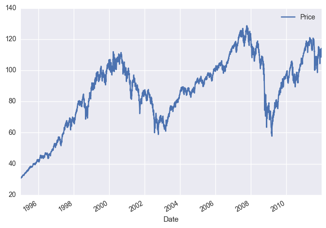
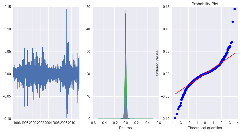
Some plots to see the distribution of returns:
returns=data['Returns']
fig=plt.figure(figsize=(12,6))
plt.subplot(1,3,1)
plt.plot(data['Date'],returns)
plt.subplot(1,3,2)
sns.distplot(returns)
print(returns.mean(),returns.std())
spac=np.linspace(-0.5,0.5,100)
from scipy.stats import norm
plt.plot(spac,norm.pdf(spac,returns.mean(),returns.std()))
plt.subplot(1,3,3)
sp.stats.probplot(returns,plot=plt)
sp.stats.mstats.normaltest(returns)
#Not normal! And negative tails are more painful. We can exploit this!
0.0003905978881567397 0.013100444387213098


NormaltestResult(statistic=743.91394834138578, pvalue=2.8916026377143718e-162)
Is volatility clustered?
shift=6
data['Vol7']=returns.rolling(window=shift).std()
data['Vol7prev']=data['Vol7'].shift(shift)

fig=plt.figure(figsize=(12,6))
plt.subplot(1,2,1)
dat=sns.regplot(data['Vol7'],data['Vol7prev'])
plt.subplot(1,2,2)
sns.regplot(data['Returns'],data['Returns'].shift(7))
data.head(10)
| Date | Price | Returns | Vol7 | Vol7prev | |
|---|---|---|---|---|---|
| 1 | 1995-01-04 | 30.853865 | 0.004779 | NaN | NaN |
| 2 | 1995-01-05 | 30.853865 | 0.000000 | NaN | NaN |
| 3 | 1995-01-06 | 30.885254 | 0.001017 | NaN | NaN |
| 4 | 1995-01-09 | 30.916713 | 0.001019 | NaN | NaN |
| 5 | 1995-01-10 | 30.948169 | 0.001017 | NaN | NaN |
| 6 | 1995-01-11 | 30.969097 | 0.000676 | 0.001693 | NaN |
| 7 | 1995-01-12 | 30.979628 | 0.000340 | 0.000429 | NaN |
| 8 | 1995-01-13 | 31.346386 | 0.011839 | 0.004509 | NaN |
| 9 | 1995-01-16 | 31.535063 | 0.006019 | 0.004608 | NaN |
| 10 | 1995-01-17 | 31.545528 | 0.000332 | 0.004689 | NaN |
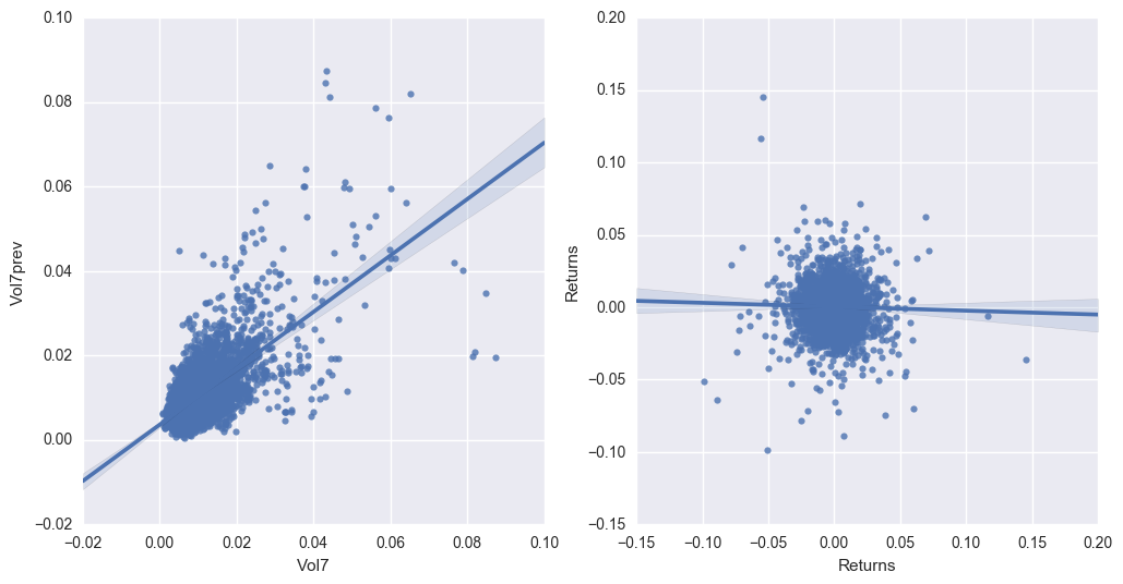
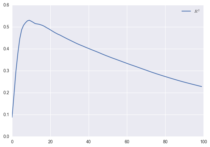
Returns are not good predictors of future returns. Volatility is for future volatility. Let’s check different time periods for the correlation.
n_space=100
r2s=np.zeros((n_space,1))
for i in range(n_space):
    shift=i+2
    VolPrev=returns.rolling(window=shift).std().shift(shift)
    nans=np.isnan(VolPrev)
    VolPrev=VolPrev[~nans]
    Vol=returns.rolling(window=shift).std()[~nans]
    slope, intercept, r_value, p_value, std_err =sp.stats.linregress(VolPrev,Vol)
    r2s[i]=r_value**2
plt.plot(r2s,label='$R^2$')
plt.legend()
#Apple: peak at 200
#SPY: peak at about 7
#WMT: peak at about 50
lags=[7,14,30,60,120,150,200,250]
for i in lags:
    data['Vol'+str(i)+'prev']=data['Vol7'].shift(i)
finalset=data.dropna().copy()
finalset['IsPositive']=data['Returns']>0
finalset['IsHigh']=data['Vol7']>np.percentile(finalset['Vol7'], 99)

finalset.head()
data['Vol7'].describe()
count    4276.000000
mean        0.010982
std         0.007648
min         0.000429
25%         0.006083
50%         0.009384
75%         0.013506
max         0.087321
Name: Vol7, dtype: float64
Now, let us Bring on the M A C H I N E L E A R N I N G
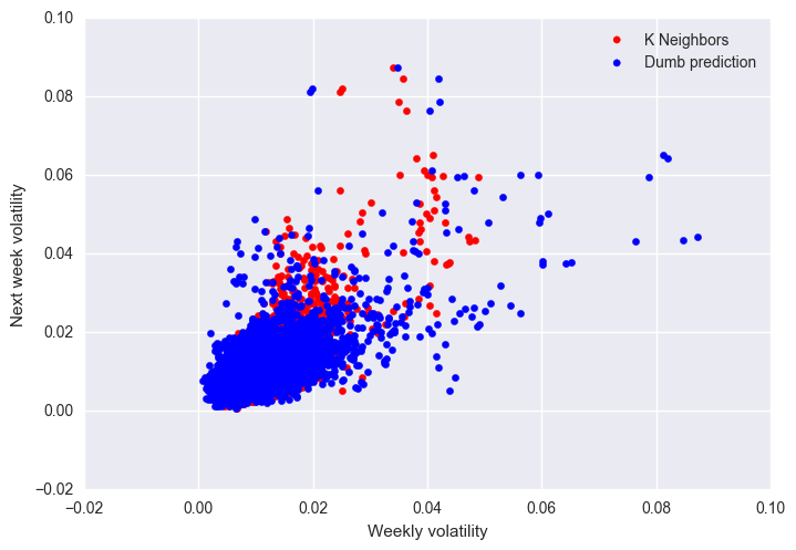
We will try to use some algorithms to predict future volatility, and use that later. As a benchmark, today’s volatility is used to predict tomorrow’s volatility.
Y=finalset['Vol7'].values
noms=['Vol'+str(i)+'prev' for i in lags]
#noms.insert(0,'Vol7')
X=finalset[noms].values
from sklearn import  linear_model
from sklearn import  neighbors
from sklearn import model_selection
from sklearn import svm
from sklearn.metrics import r2_score
#reg=linear_model.RidgeCV(alphas=[0.05,0.1,0.2,0.5,1,2,5,10,20,100])
params2={'n_neighbors':[3,4,5,6,7,8,9,10,15,20],'p':[1,2]}
#params3={'C':[0.05,0.1,0.5,1,2],'nu':[0.5,1,0.1],'kernel':['linear','rbf','sigmoid']}
reg2=model_selection.GridSearchCV(neighbors.KNeighborsRegressor(),params2,n_jobs=-1,cv=5)
#Because SVR was not working
#reg3=model_selection.GridSearchCV(svm.NuSVR(),params3,n_jobs=-1,cv=5)

#reg.fit(X,Y)
reg2.fit(X,Y)
#reg3.fit(X,Y)
#print('%.3f'%reg.score(X,Y))
print('R2 for K Neighbors: %.3f'%reg2.score(X,Y))
#print('%.3f'%reg3.score(X,Y))
print('R2 for Dumb prediction: %.3f'%r2_score(Y,finalset['Vol7prev']))
#plt.scatter(reg.predict(X),Y,label='Regularised Linear')
plt.scatter(reg2.predict(X),Y,color='red',label='K Neighbors')
#plt.scatter(reg3.predict(X),Y,color='green',label='SVR')
plt.scatter(finalset['Vol7prev'],Y,color='blue',label='Dumb prediction')
plt.legend()
#0.593 vs 0.459
finalset['PredictedNext']=reg2.predict(X)
finalset['PredictedNext']=finalset['PredictedNext'].shift(1)
finalset.dropna(inplace=True)
finalset.head()
plt.xlabel('Weekly volatility')
plt.ylabel('Next week volatility')
R2 for K Neighbors: 0.587
R2 for Dumb prediction: 0.314


<matplotlib.text.Text at 0x7f5e8f17a828>
I tried classification, but it didn’t give better results:
# Y=finalset['Vol7'].values
# #Previous volatilities add nothing if we know past week's volatility
# #noms=['Vol'+str(i)+'prev' for i in lags]
# #noms.insert(0,'Vol7prev')
# noms=['Vol7prev']
# X=finalset[noms].values
# from sklearn import  linear_model
# from sklearn import  neighbors
# from sklearn import model_selection
# from sklearn.metrics import confusion_matrix
# params={'C':[0.1,0.2,0.5,0.7,1,1.2,2,5,10]}
# reg=model_selection.GridSearchCV(linear_model.LogisticRegression(),params,cv=5,n_jobs=-1)
# params2={'n_neighbors':[3,4,5,6,7,8,9,10],'p':[1,2]}
# params3={'alpha':[1e-3,1e-4],'activation':['relu','logistic']}
# reg2=model_selection.GridSearchCV(neighbors.KNeighborsClassifier(),params2,n_jobs=-1,cv=5)

# reg.fit(X,Y)
# reg2.fit(X,Y)
# #reg3.fit(X,Y)
# print('%.3f'%reg.score(X,Y))
# print('%.3f'%reg2.score(X,Y))
# plt.plot(reg.predict(X),Y)
# plt.subplot(1,2,1)
# sns.heatmap(confusion_matrix(Y,reg.predict(X)),annot=True,fmt='')
# plt.title('Confusion Matrix (Logistic Regression)')
# plt.subplot(1,2,2)
# sns.heatmap(confusion_matrix(Y,reg2.predict(X)),annot=True,fmt='')
# plt.title('Confusion Matrix (K Neighbors)')
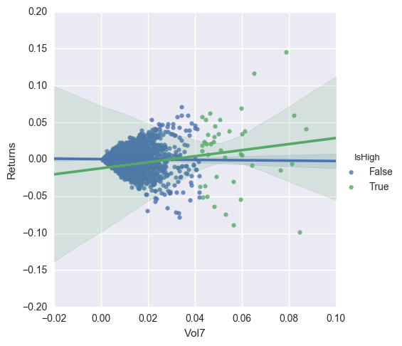
In this plot, I show the relation between volatility and returns both for the typical cases and the high volatility cases, defined for this plot as those instances of volatility above the 99th percentile. Ideally the slope for the IsHigh case should be negative, but often it is not the case.
sns.lmplot('Vol7','Returns',data=finalset,hue='IsHigh')
<seaborn.axisgrid.FacetGrid at 0x7f5e8f41a0b8>
Now I will run some simulations for a few cutoff values, and see what happens. I plot the evolution of the time series relative to the baseline asset.
cutoffs=[90,95,96,97,98,99,99.5,99.9]

serie=np.zeros((len(finalset.index),len(cutoffs)+1));
sns.set_palette(sns.color_palette("viridis",n_colors=len(cutoffs)))
fig=plt.figure(figsize=(12,6))
gain={}
for j,cut in enumerate(cutoffs):
    cutoff=np.percentile(finalset['Vol7'], cut)
    for i,row in enumerate(finalset.iterrows()):
        if i!=0:
            serie[i,0]=(1+row[1]['Returns'])*serie[i-1,0]
            if(row[1]['PredictedNext']>cutoff):
                serie[i,j+1]=serie[i-1,j+1]
            else:
                serie[i,j+1]=(1+row[1]['Returns'])*serie[i-1,j+1]
        else:
            serie[0,:]=1

    plt.plot(finalset['Date'],serie[:,j+1]/serie[:,0],label='Cutoff percentile: '+str(cut))

sns.set_palette(sns.color_palette("deep"))
plt.legend(loc='upper center',frameon=True,fancybox=True,ncol=3)
plt.figure()
plt.scatter(cutoffs,(serie[-1,1:]/serie[-1,0]))
plt.ylabel("Final gain vs Asset")
plt.xlabel("Cutoff percentile")
<matplotlib.text.Text at 0x7f5e906c9898>
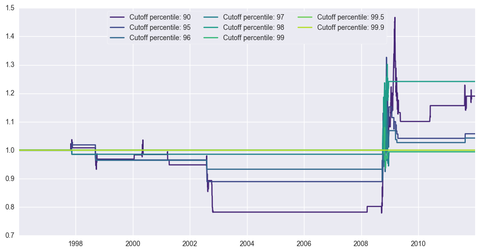
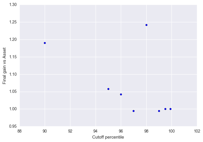
For SP500, we outperform for all cutoff percentiles above 90. Best outperformance occurs at 96 and 98.
For MSCI Australia, we outperform for cutoff percentiles above 95, where outperformance occurs.
For MSCI Mexico, we outperform for a cutoff of 90, but underperform for percentiles between 95 and 98, and regain parity with percentiles above 98.
For MSCI Germany, we outperform for a cutoff between 90 and 96.
For MSCI UK, we outperform for all cutoff percentiles above 90.
Let us consider the period starting in 2010, after the crisis. Can we do better than the market during those years using this method?
For SP500, outperformance cutoff is at 95 now, but not by much. Then at 97 there is a drop.
For MSCI UK, outperformance cutoff is 98.
Conclusion
Can we outperform markets by timing volatility? Sort of: Only during periods of crisis this seems to be a factible strategy, but the cutoff values for volatility depend on the asset traded. The gains in general are small, anyway.
I haven’t taken into account trading fees for these models. Perhaps including it reduces considerably the odds of outperformance.
I wouldn’t recommend doing it, then.
